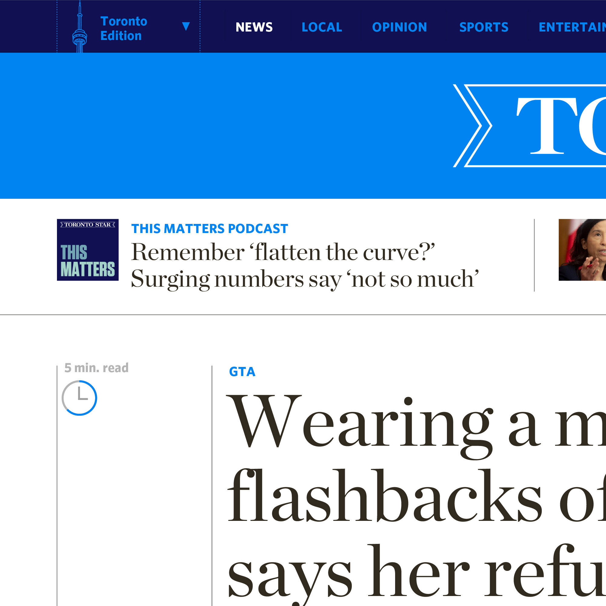
As a treasured institution with a heritage of fighting for the common man, the Toronto Star has a solid base of support within the Canadian media ecosystem. But with increasing competition for attention, it must develop a strong bond with its readership through a more considered brand experience that diminishes price sensitivity and drives attachment.
The team I led developed a vision for a unified set of experience principles which all teams can align around and an ideal future state experience, mapped end to end.
Operating for years without design standards, we looked to the paper's heritage in devising a visual language that would set it up for an integrated cross-platform experience.
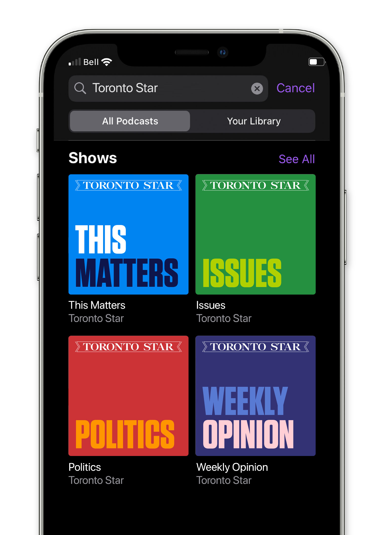
We considered aspects of growth for the business that are also a bit more tricky for a brand to live in.
Subcribing to any media is comparable to joining a club of like-minded individuals. Creating tokens of that belonging can strengthen the bond of membership to that community.


The homepage of the website is a marquee touchpoint that allows us to optimize typographic conventions.
We developed a set of design standards to streamline and elevate digital experiences.
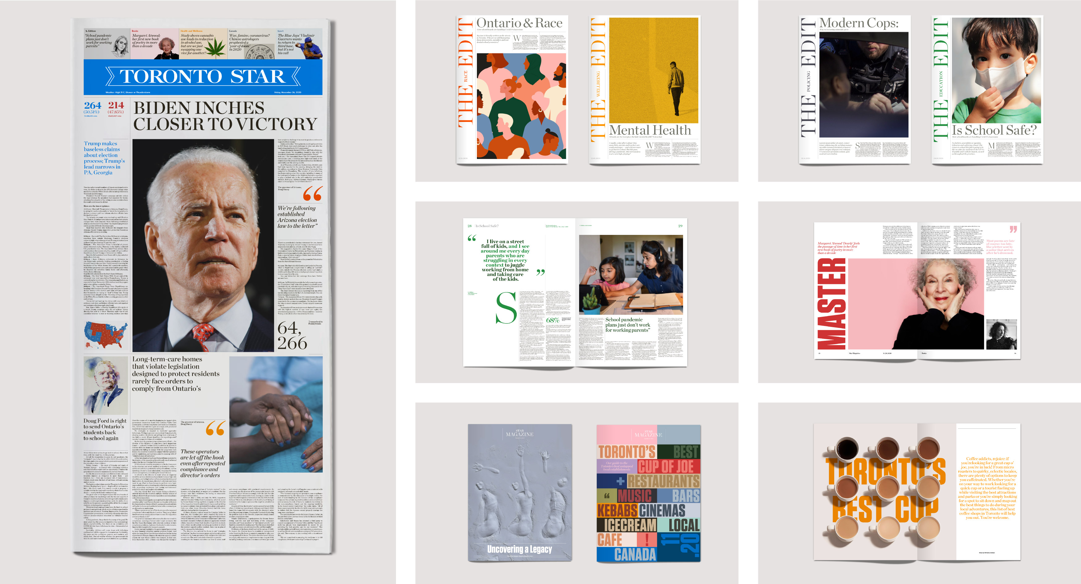
Treating print as a more elevated experience for those that like spending time with a physical medium will endear the brand to its most faithful, and least price-sensitive subscribers.
The ribbon wordmark is iconic and enjoys widespread recognition in the Greater Toronto Area. We simplified its treatment and devised a rational treatment to its resizing.
© 2021, David Jalbert-Gagnier
