City of Oakland
Channeling Oakland’s unique voice into a clear visual identity and compelling digital experience.
Visual Identity
Digital Design
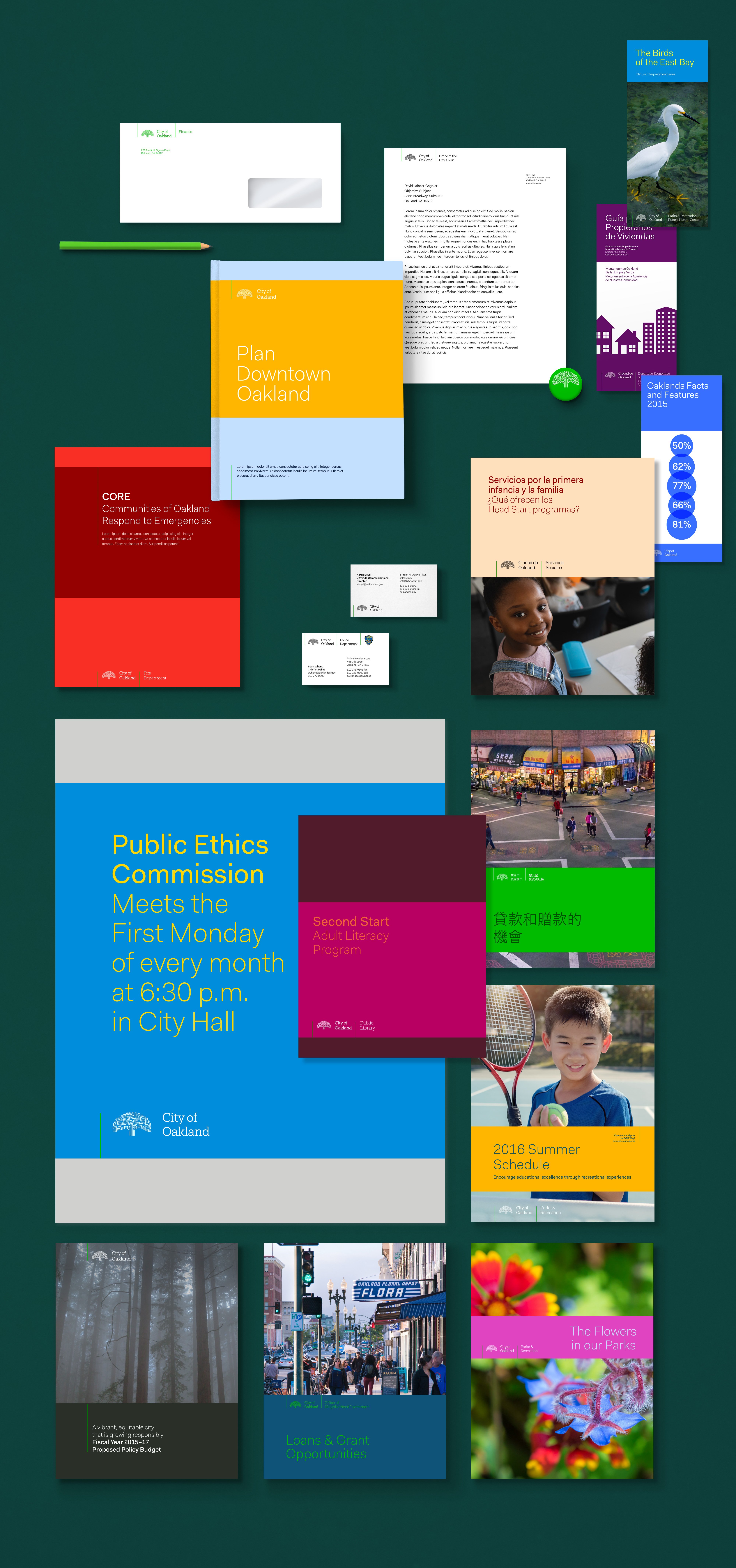
Oakland, California is a diverse and dynamic community, with rapid change nearly a constant throughout its storied history. In order to deliver better services to that community, and clarify the services it provides, the City government worked with Code for America to define an ownable look and feel for all of its strategies and actions.
A Symbol
For many decades, a stylized oak tree has represented the city and its intertwined citizenry. In fact, the symbol has become so popular that many in the community embrace it to brand their store, organization, and even bodies. While such a wellspring of adoption is any community’s dream, this widespread use exposed the need to create a differentiated interpretation of the symbol, so it can be made clear when the government is communicating.
In the past, the City never had a concerted approach to visual communication. The resulting cacophony of symbols across city departments did not connote the clarity and simplicity that should be the hallmark of any experience with a large organization.

As we defined the color scheme, we wanted to help Oakland break through the clutter of commercial activity by giving it a clear and bold look. We paired a dominant color, an energetic green hue, to a rich range of complimentary hues, and created a typographic system that emphasizes clarity and lack of ornament.

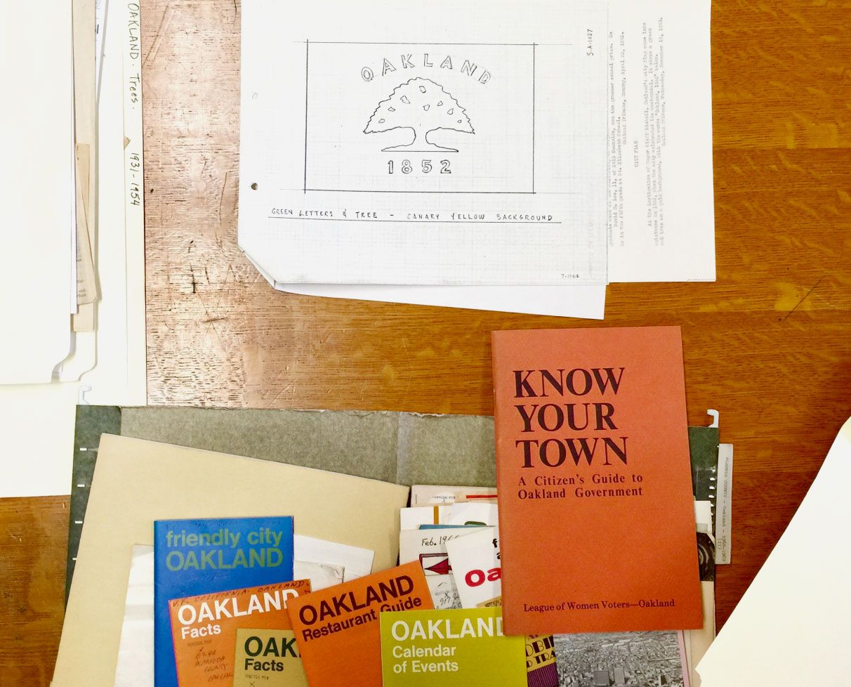
We first performed in-depth research and a far-reaching visual audit. Immersed in the City’s Archives, we traced the original use of the symbol to the early 1970s.
Throughout its history, it has received few tweaks, and retains a special kind of beauty which we were keen to preserve. But with its high recognition and unique properties, there were still various issues with the mark, especially how it rendered in smaller contexts.
We collaborated with type designer Jesse Ragan to treat the symbol as we would from a typeface glyph, to give it better optical legibility, especially on-screen and at small sizes.
Hey there, this is the default text for a new paragraph. Feel free to edit this paragraph by clicking on the yellow edit icon. After you are done just click on the yellow checkmark button on the top right. Have Fun!
The City should be able to modulate its expression without always employing a blunt use of the logo. We created a pattern that, while related to the tree logo, grows it into a full root system, as complex and rich as the communities and network that support the city. This pattern can be applied to elements in overt or subtle ways, based on the context.
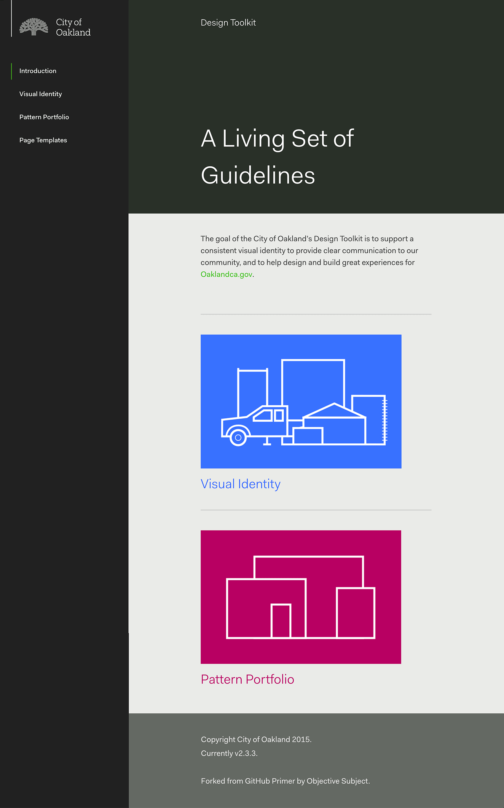
In this same spirit of open development, the portfolio library is publicly available, along with a design toolkit created to support designers, agencies and civil servants in creating material to fit the new visual identity.


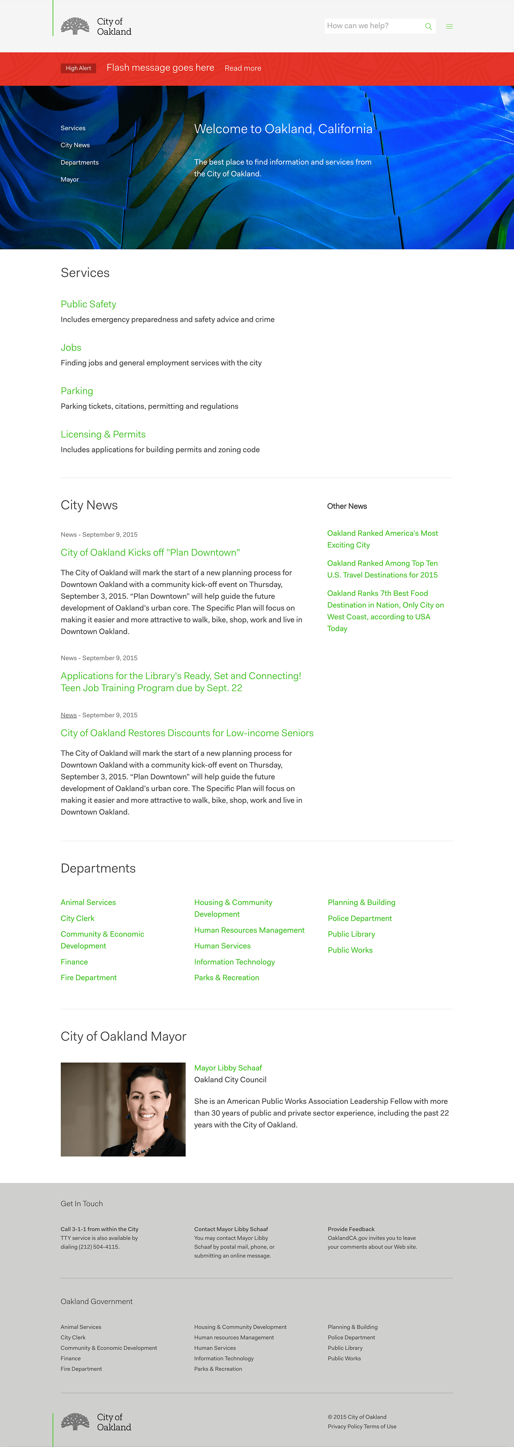
The digital platform continues to be updated to match the needs of the City.


© 2021, David Jalbert-Gagnier