Founded as a demonstration of Bard College’s commitment to the performing arts as a societal and educational necessity, the Fisher Center inspires creativity, connection, and community through the performing arts.
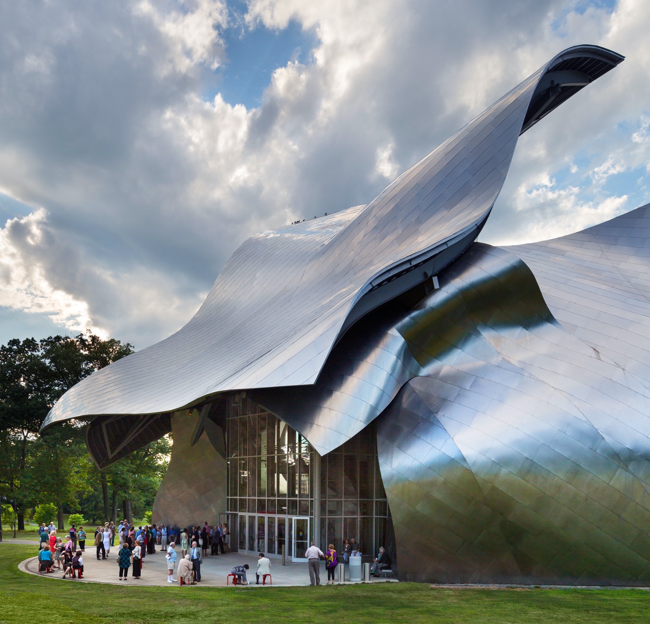
Its home, the Fisher Center for the Performing Arts, was designed by Frank Gehry to provide world-class performing arts facilities to students, professional artists, and audiences. Nestled on the bucolic Bard campus in New York’s Hudson Valley, the building sets the stage for exploratory creativity, high-caliber artistry, and inquisitive learning.
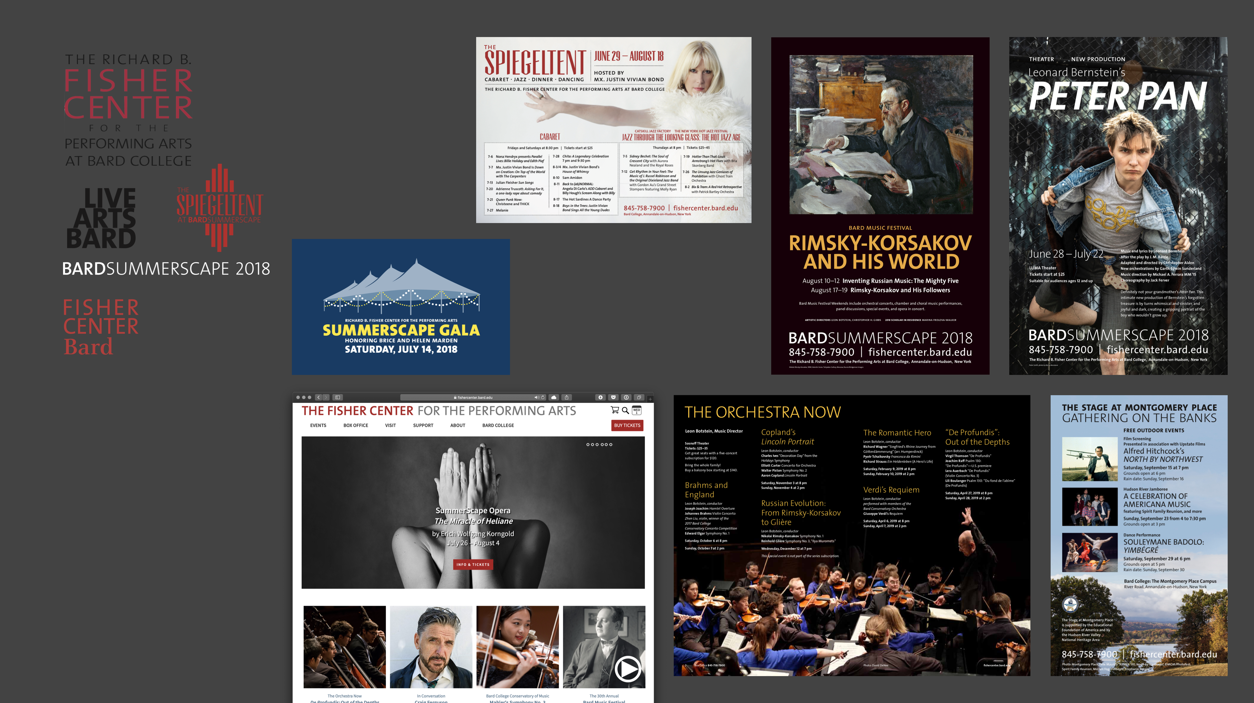
But with many accolades and successful productions touring the world, the Center struggled to unify its communication across its broad range of offerings, which range from top-shelf commissioned and developed performances to creations by its student community.
My team and I oversaw the development of a system of brand elements that would come together to convey the Fisher Center’s holistic identity.
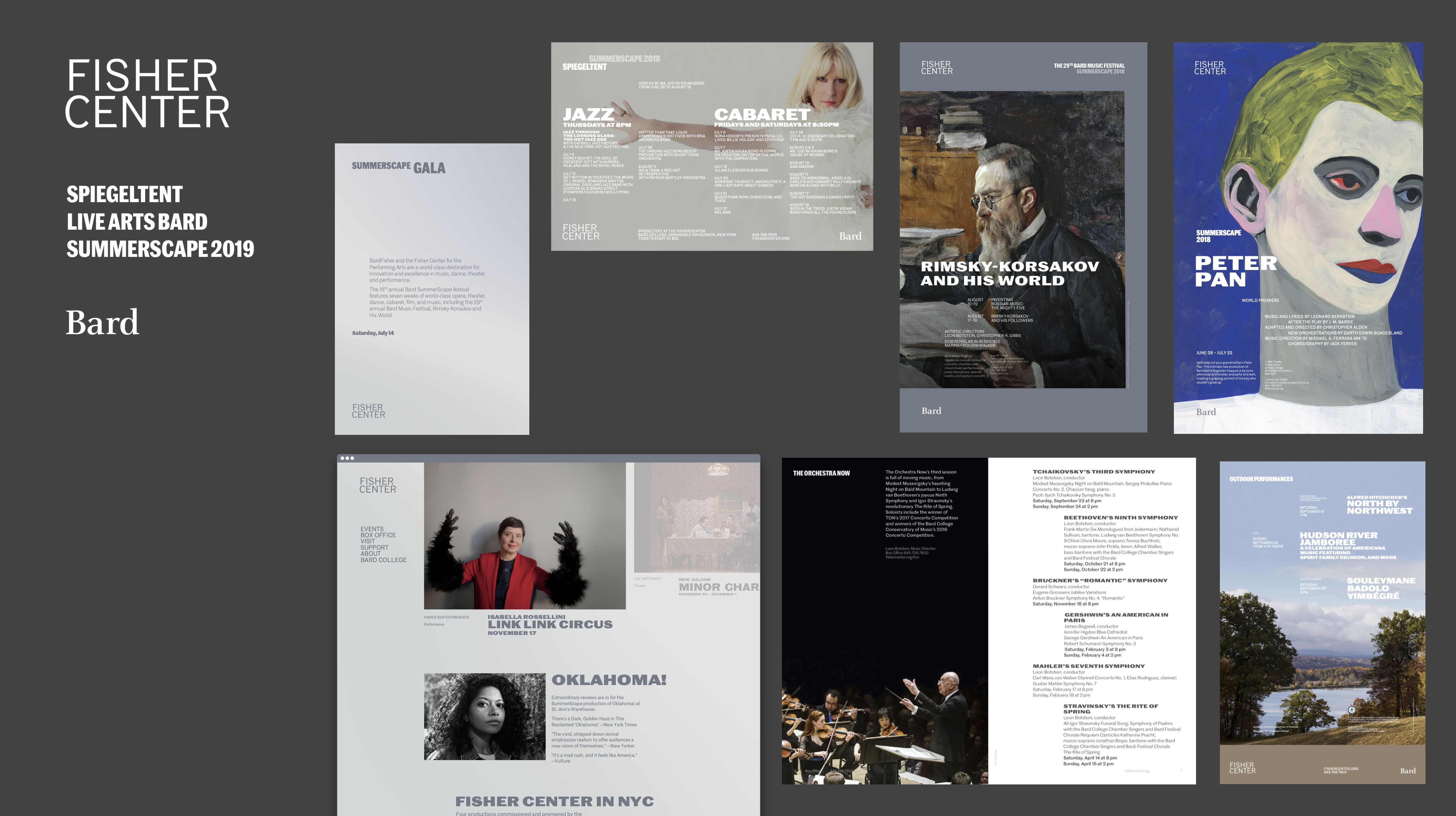
We conducted a series of activities with board members, staff and other members of the community, ranging from one-on-one interviews to facilitated exercises. These yielded a set of recommendations that led us to create a visual identity system as well as getting agreement on a single, consistent name: Fisher Center at Bard.
The brand architecture reveals a clearer hierarchy between the college and the center and extends to the various programs, both professional and academic.

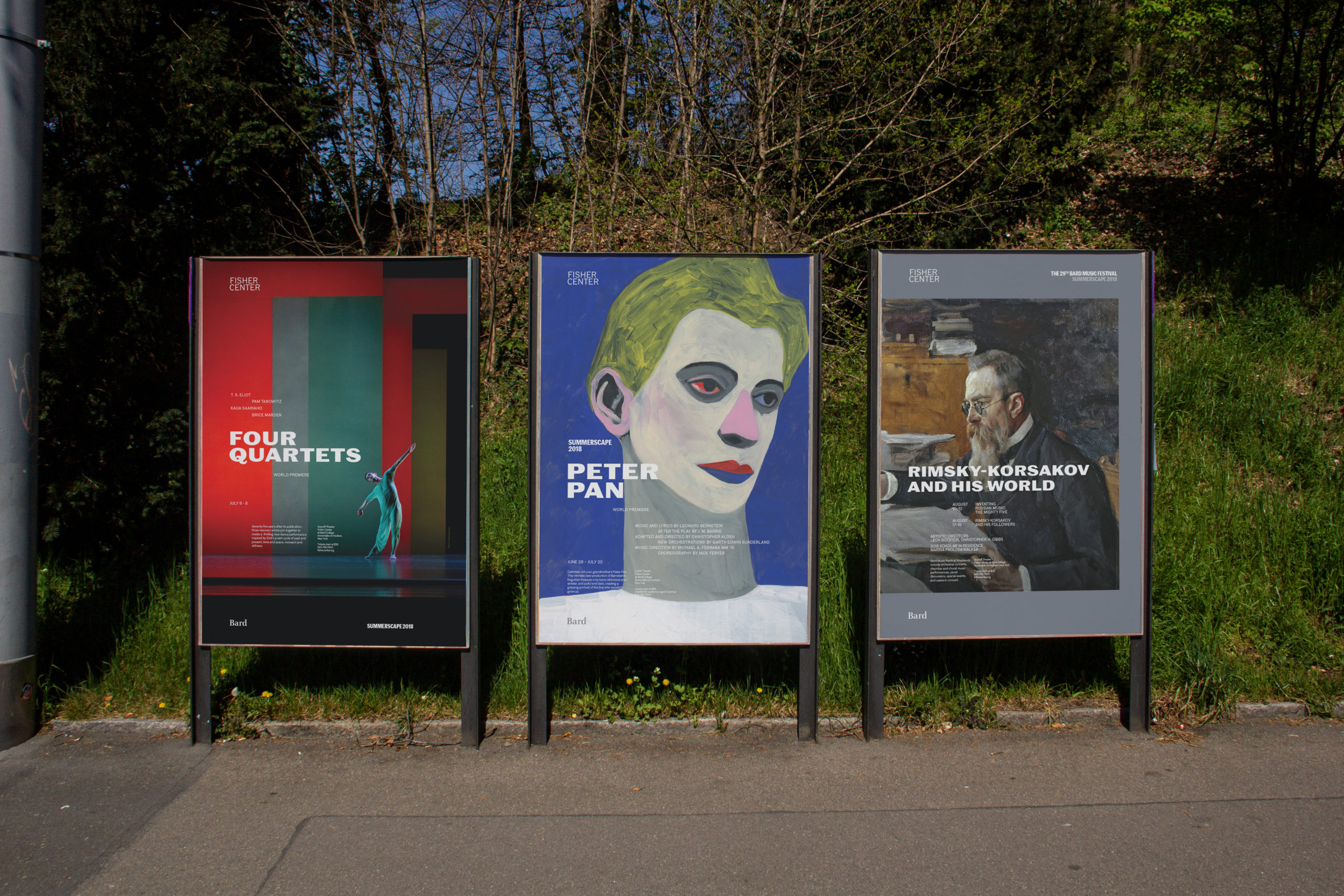
This organization is manifested through a typographic system based on the face by Commercial Type, Marr Sans. We collaborated with their team to commission a new weight, Wide Bold, to serve as the marquee

The typographic universe is an integral part of the identity system
Finally, we looked for a suitably sophisticated way to channel the iconic nature of the Frank Gehry structure, and found that indeed it was its reflectiveness to the surrounding nature that best fit the diversity of programming to convey. As such, the color palette simply channels the colors that day-in, day-out, through the seasons, see themselves cast upon the structure.
The result is an understated system befitting the cultural institution, driven by the content, sober typography and soothing colors.
© 2021, David Jalbert-Gagnier