What makes an ideal passenger experience?

How does finding one’s way easily play into it?

What information matters in devising a successful strategy?

As part of a multi-disciplinary team of 12, I inspired the team and provided design and conceptual vision for experience guidelines across all steps of the passenger journey.
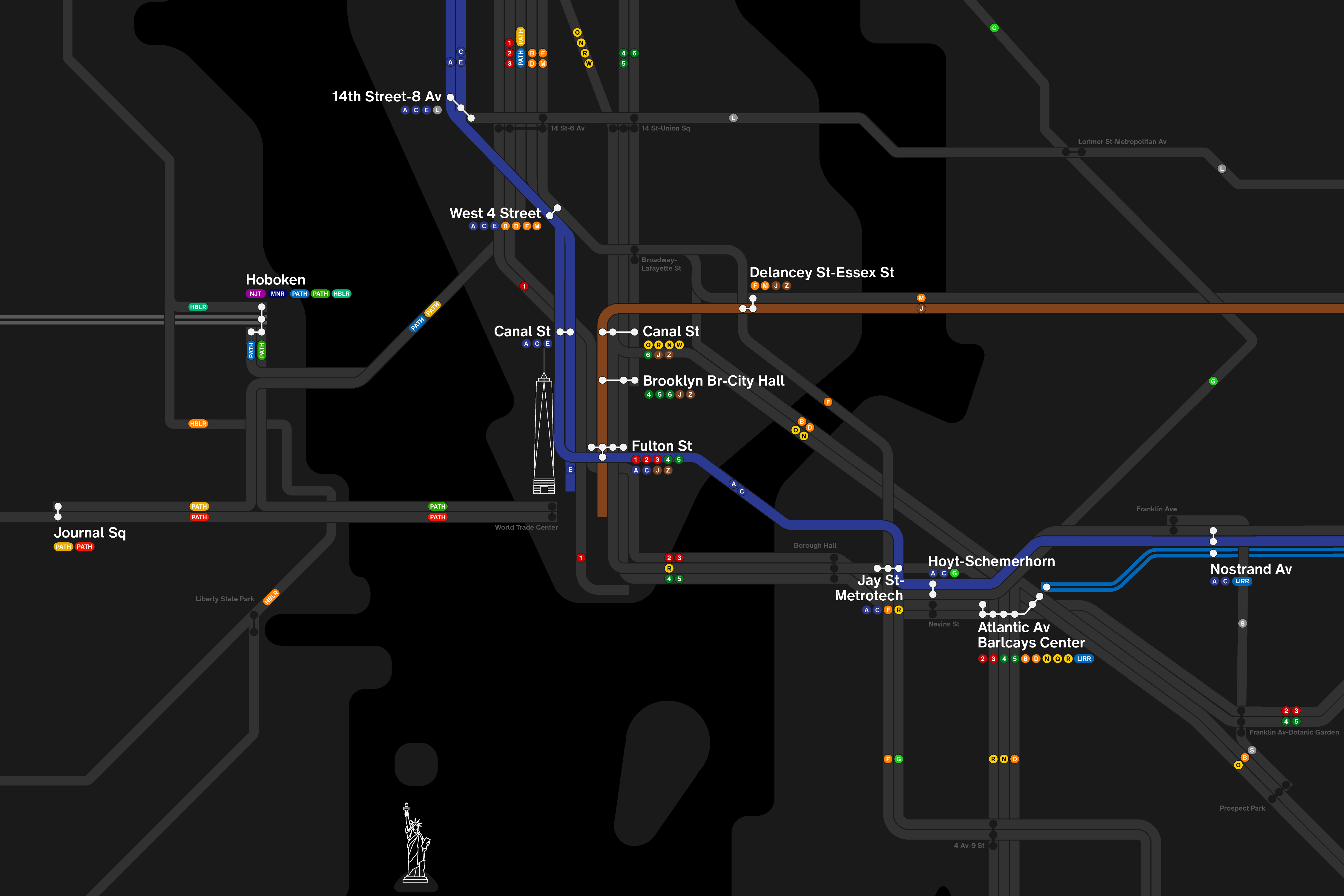
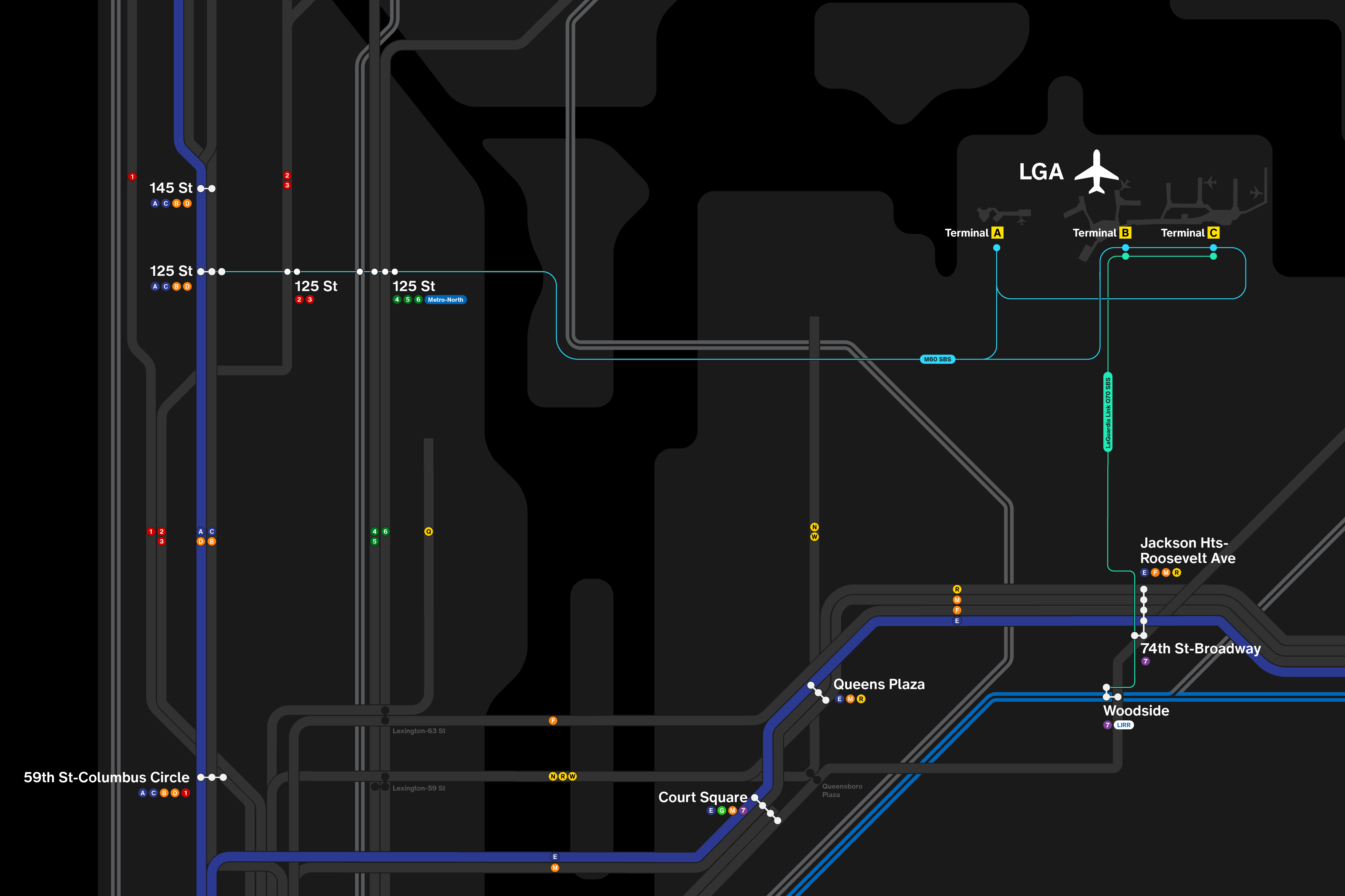
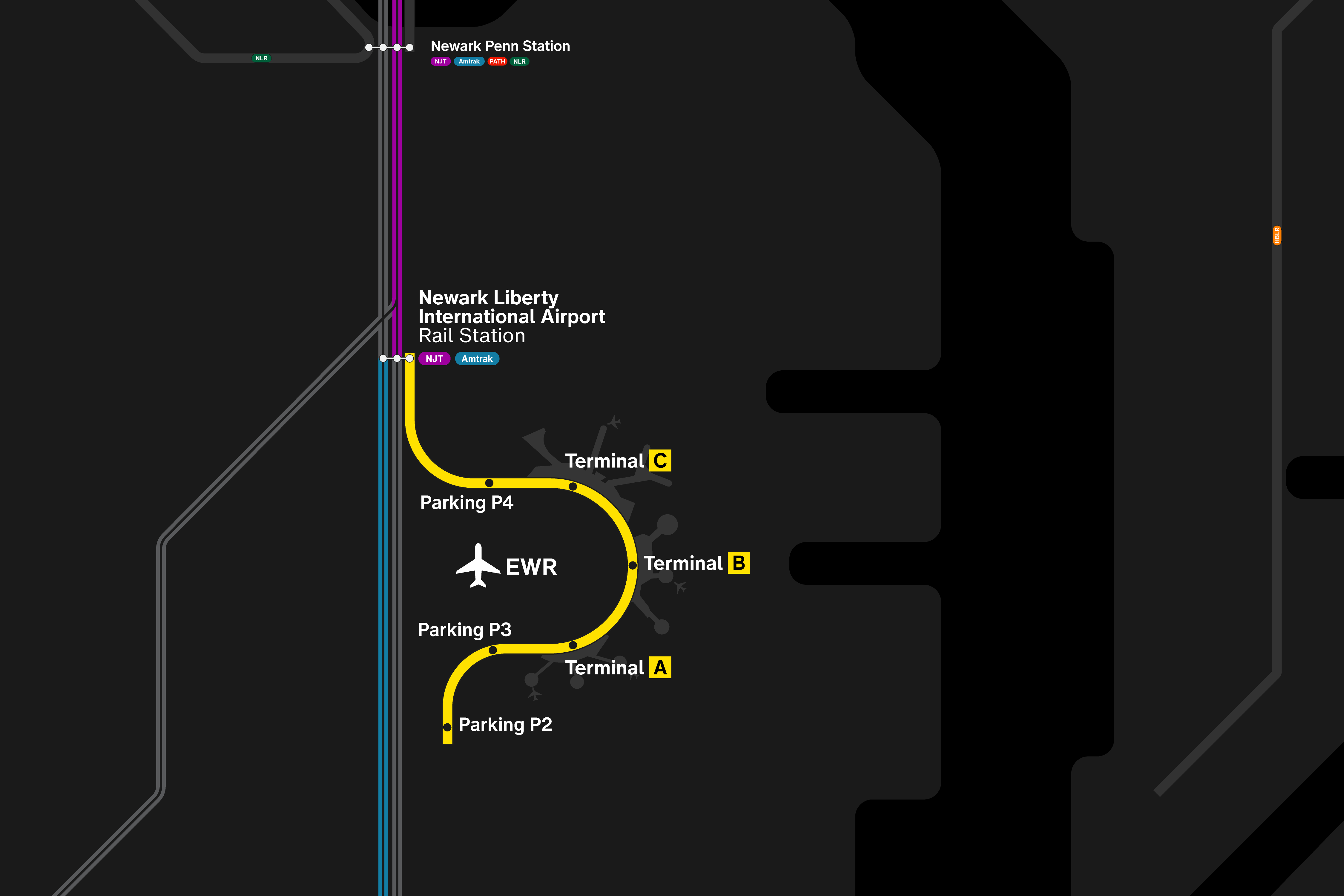
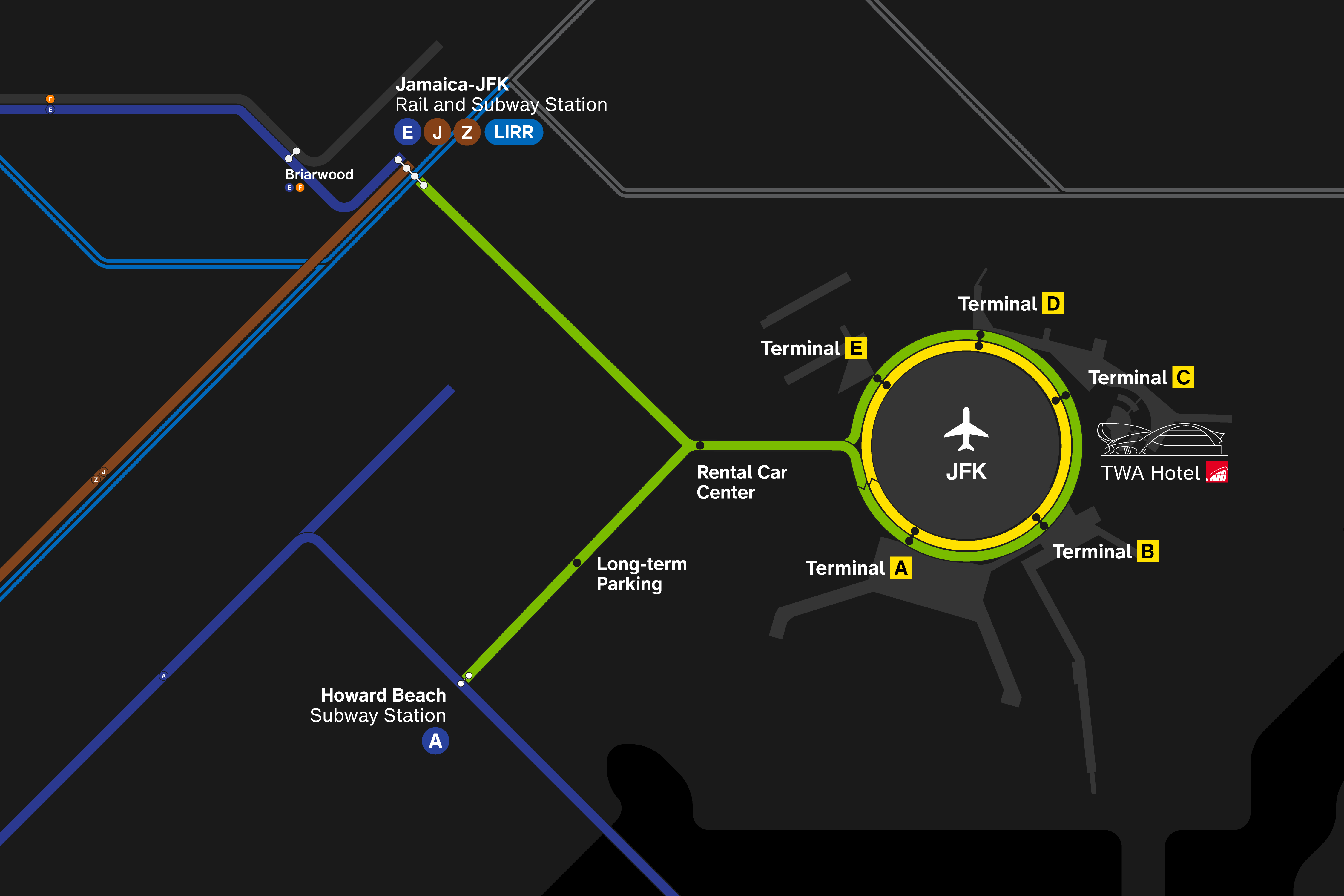
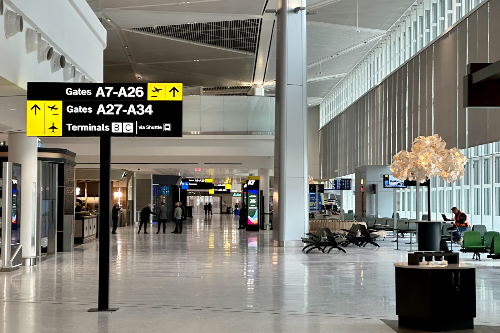
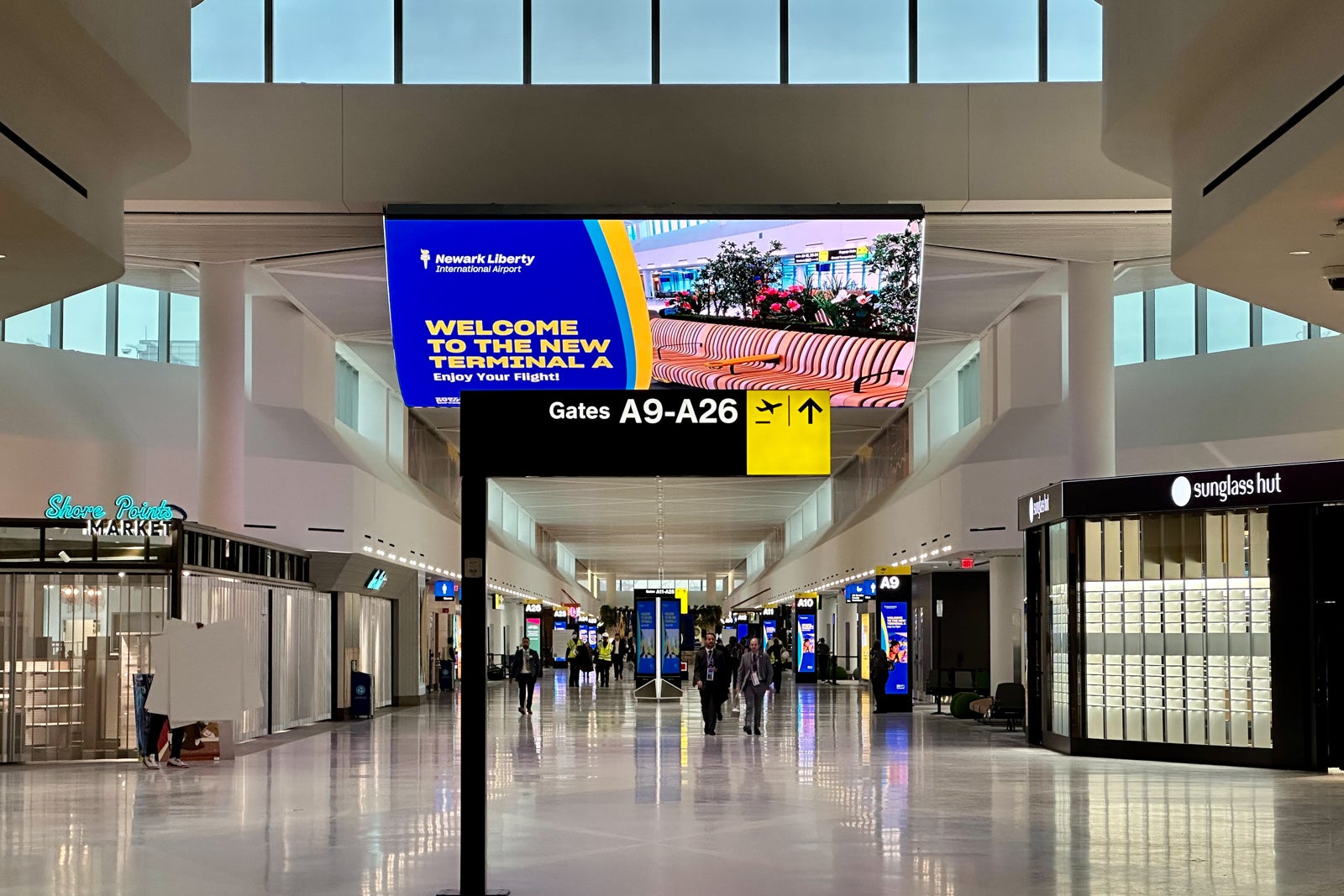
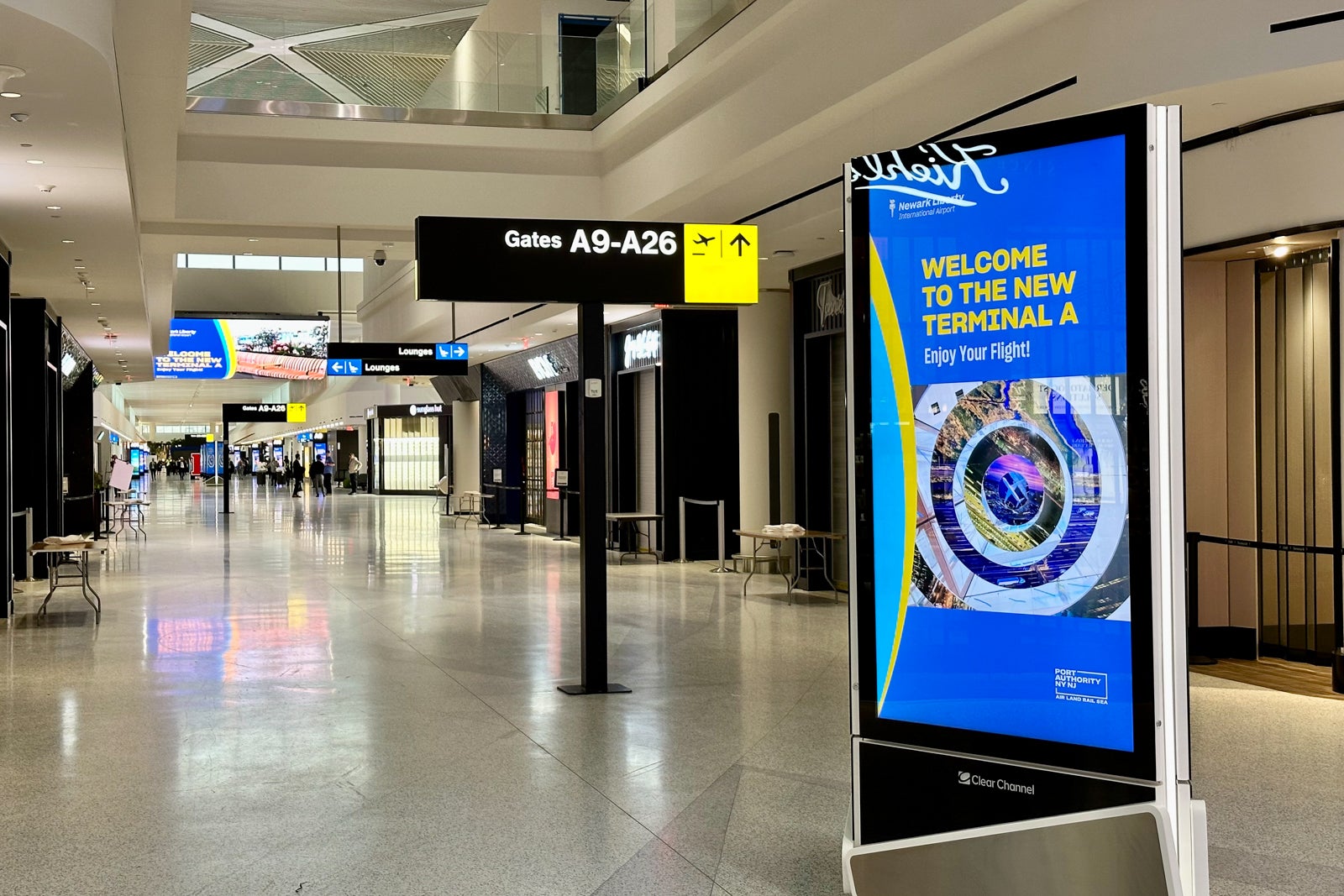
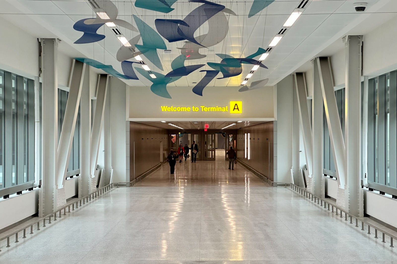
As the custodian of the New York City region’s airports, the Port Authority of New York & New Jersey had a mandate to bring back its experience to a world-leading poll position. As part of a $25B+ redevelopment project at J.F.K., LaGuardia and Newark-Liberty airports, our work sought to define what a 21st Century wayfinding experience should be like.
The scope ranged from 2D (color, typography, pictograms) to 3D (industrial design, use of space), and from analog to digital applications, including mapping and other information systems. I also mentored junior designers and led presentations to executive leadership articulating design concepts and strategy, and oversaw partner agency Monotype on delivery of custom typeface.
We worked with Monotype to evolve Helvetica, an iconic typeface that is well-represented in the region, into a performant wayfinding typeface. Focus on problem letters, photos of tests
Our work started with a benchmarking of top-rated current and upcoming airport projects, out of which we developed a set of areas to focus on for improvements, including connections, spatial zoning, governance and sense of place. We also embarked on a systematic audit of all 13 terminals at 4 airports, doing an exhaustive documentation of all existing signage and wayfinding issues, producing a report detailing which one called for immediate remediation. It called for an important evolution of the existing standards, which were over 20 years old. To boot, modern standards now demand a broader scope than they did back then. AirTrain, Ridesharing, TSA Security were not factor when most of the existing terminals were built, and ad hoc revamping of processes which had let inconsistencies creep through the experience.
Prototyping is underway for the system to go live at JFK in 2023.
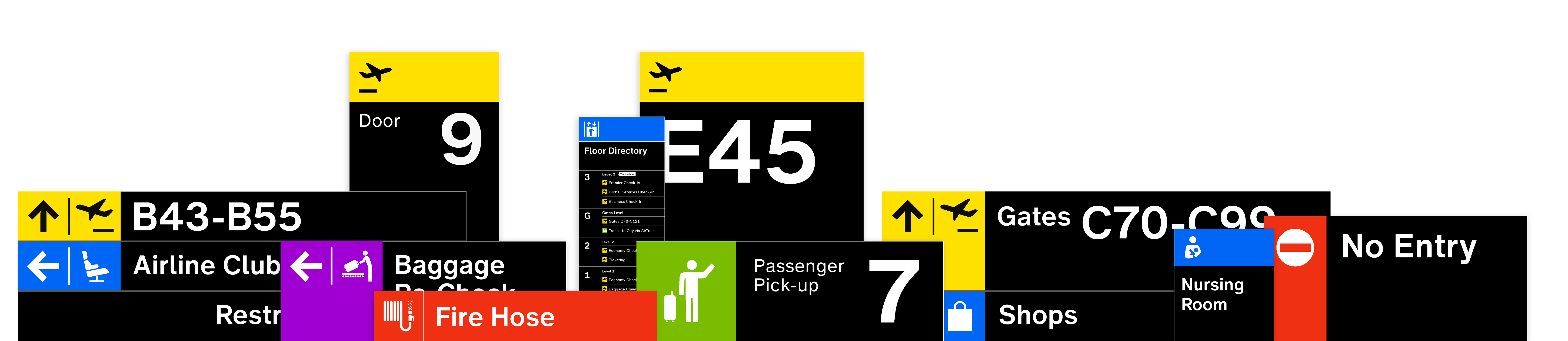
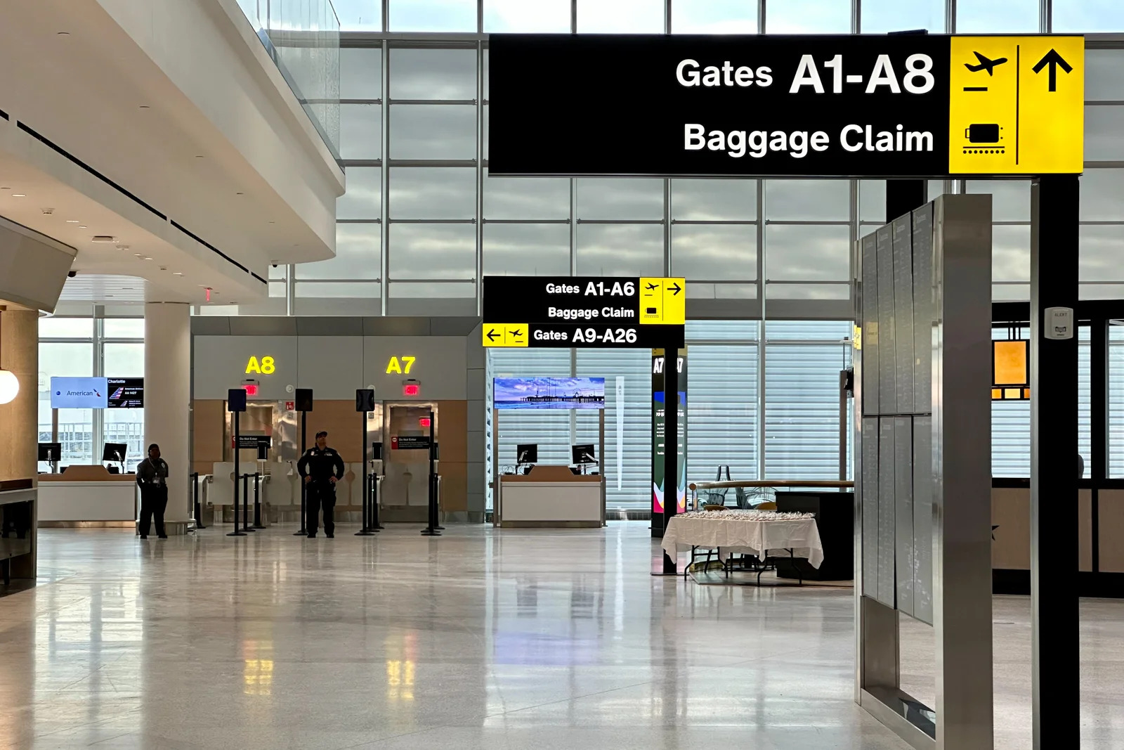
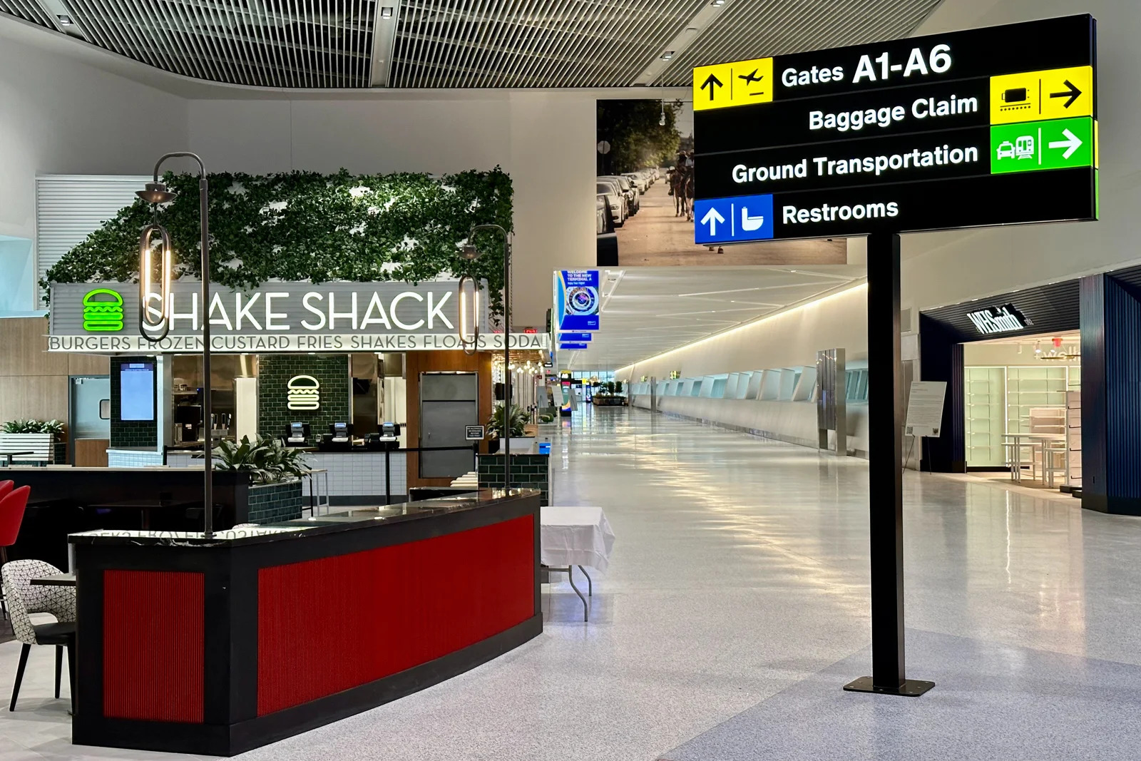
We sought to bring the bold, confident and exciting nature of the New York City region into a wayfinding identity that would stand the test of time. This is manifested in both the graphic and industrial design language, from pictograms to materials.
Traditionally, signage information occupies but one face of a 3D wayfinding object. We took the opportunity to turn the sign into a beacon that traces a path from the passenger’s position to their destination, no matter the angle of approach.
Implementation strategy
After identifying the hurdles to successful implementation of the previous system, we aimed to provide a more robust and approachable background on wayfinding—not just technical specifications, but easy-to-understand explanation of the concepts behind them. We significantly expanded resources on foundational (but often invisible) elements of good wayfinding, such as the wayfinding journey, inclusive design, and natural wayfinding. We also included strategies on spatial zoning, terminology, and information hierarchy.
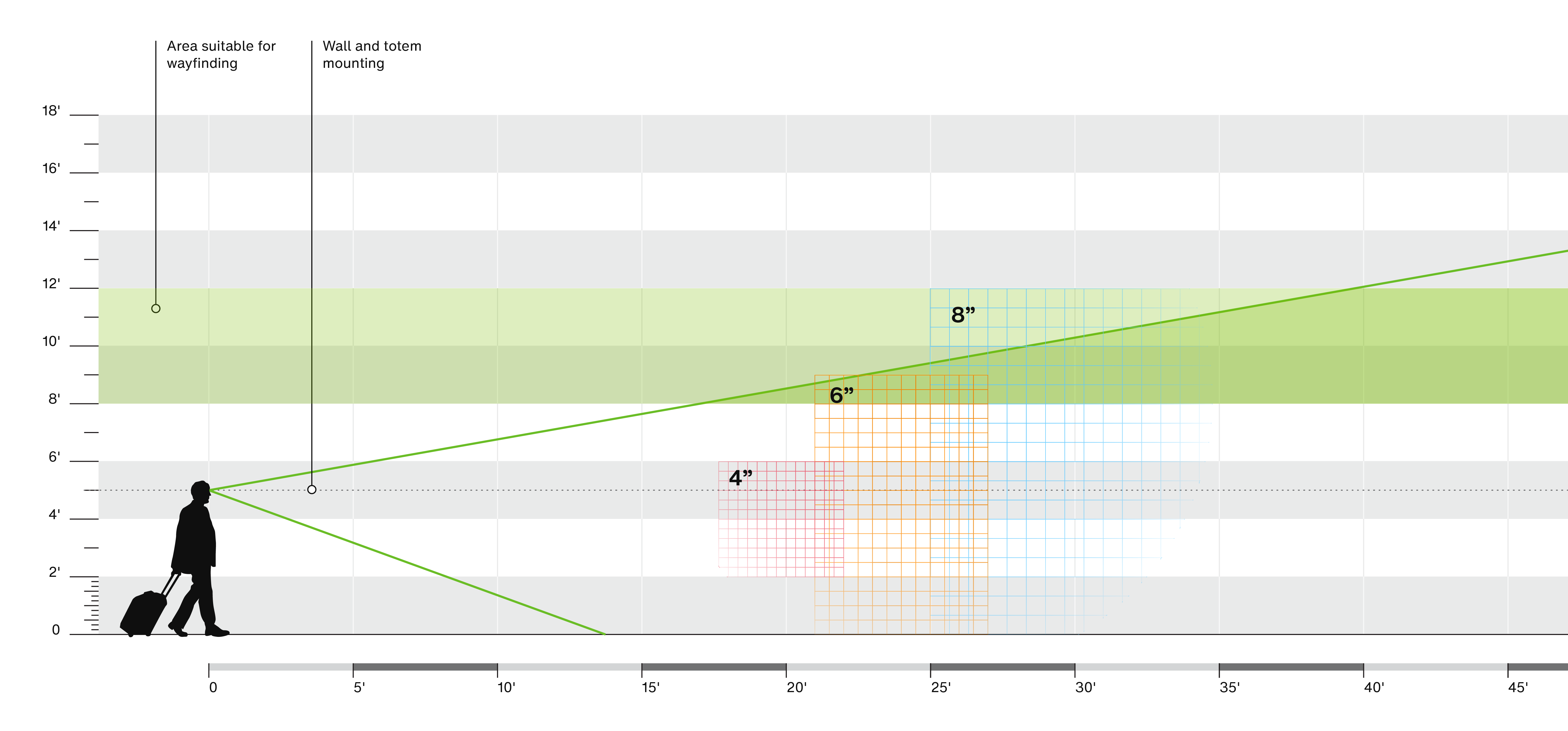
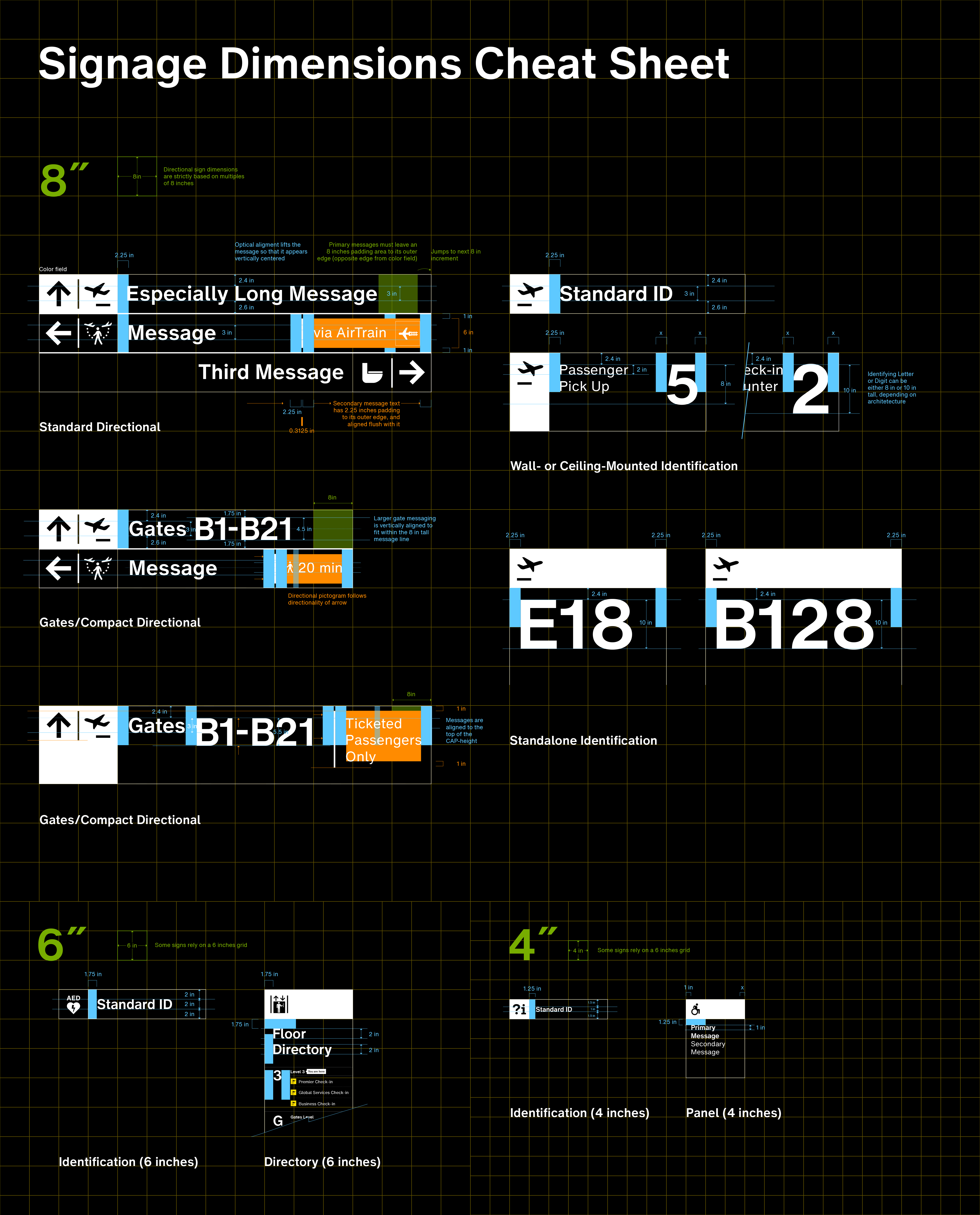
We developed a scale system determining the dimensions of all elements, depending on their proximity and type of information. Isometric spatial grid gets revealed, highlights alignments of wayfinding elements
We conceived the new manual in a web-first format (with an auto-generated PDF) in order to provide easier access on any device, to a range of audiences. This format encourages iteration and ensures that the manual can be easily updated. It serves as the singular hub for the latest guidelines, to download assets, and submit questions.
wayfinding.panynj.gov

© 2021, David Jalbert-Gagnier